BlogApps
Your app works. Now it needs a landing page
You built a first version, and its front door is a sign-in screen. Here is what a landing page has to answer in its first screen, how to show the product, and what never to invent.
Building the first version of an app has become a matter of days. A good prompt, a tool that writes the code, a weekend of fixing what it got wrong, and there is something real at an address that works. Then you send that address to someone, and what they see is a sign-in form.
The app is the product. The landing page is the answer to a different question, asked by someone who has not decided anything yet: what is this, and is it for me? It is a small page, and most of what makes it good is restraint. This is what we would put on it, in the order a visitor needs it.
Five questions the first screen has to answer
A visitor gives a new page a few seconds before deciding whether to scroll or leave. In that time, without scrolling, they should be able to tell:
- What is it? A noun they already know. “An invoicing app”, “a habit tracker”, “a booking page for tattoo studios”.
- Who is it for? If the answer is “everyone”, the visitor assumes it is not for them in particular.
- What does it look like? One real screen of the product.
- What do I do next? One button, and what happens when it is pressed.
- What will it cost me? At least whether starting is free.
That is a headline, a sentence, a picture, a button and a short line under the button. Everything else on the page exists to support one of the five for the visitor who needs more before pressing.
Write the sentence before the page
Try to say what the app does in one sentence with a real verb and a real object. “Send an invoice from your phone in a minute.” “See which of your subscriptions you forgot to cancel.” If the sentence could sit on a thousand other products (“the all-in-one platform that supercharges your workflow”) it tells the visitor nothing, and they will read it that way.
A useful test: read the headline to someone who has never seen the app, then ask them what it does. If they can tell you, the headline works. If they describe something else, the headline describes something else.
The same rule holds for features. Write what a person can do, not what the system has. “Export to your accountant’s format” is a feature. “Powerful export engine” is a label on a box. Three to five of these are enough for a first version; a list of twelve reads as a list nobody chose from.
Show the product, whole and readable
For software, the screenshot is the proof. It shows that the thing exists, what kind of thing it is, and how much care went into it. How it is shown matters as much as showing it:
- Use real screens with believable content. Fill the app with data that makes sense before you photograph it. “Test test 123” in every field says the product is unfinished.
- Show the screen whole. A screenshot cropped to a decorative corner shows a texture, not a product. If a screen is shown inside a phone or a browser frame, it should fit inside it completely.
- Make it large enough to read. If the visitor cannot read at least the headings inside the screenshot, it is only a grey rectangle with a shadow.
- One screen per claim. Next to “see your month at a glance”, show the month view. A screen that illustrates the sentence beside it does twice the work of a gallery at the bottom.
- Keep phone screens in phone proportions. A tall screenshot stretched across a wide band is unreadable on the device it was made for.
What not to show: a dashboard that does not exist. Generated mock-ups of screens your app does not have are the quickest way to lose the visitor who signs up and finds something else.
One action, repeated
Decide what a convinced visitor should do: open the app, join a waiting list, install it. Then offer exactly that, with the same words, at the top of the page, after the explanation, and at the end. A page that offers “Get started”, “Book a demo”, “Join the community” and “Subscribe to updates” with equal weight is asking the visitor to do your prioritising for you.
Say what happens after the button. “Free to start, no card” or “You’ll get an invitation by email” under it removes the small doubt that stops a hand.
Proof, without inventing any
A first version has few users, no press and no famous customers. The temptation is to fill that space: a row of logos the product has never met, three testimonials from people with stock photographs, “trusted by 10,000 teams”. Visitors have seen these exact decorations on enough empty products to read them as a warning. And if one invented number is noticed, nothing else on the page is believed.
What a new product can honestly show is often more convincing anyway:
- The product itself, working: a short recording of the main thing being done from start to end.
- Who made it and why, in two sentences, with a real name and a way to write to you.
- Real numbers, however small. “38 people used it last week” is a fact. It also dates well.
- What it does not do yet. Saying so costs a little and earns a lot from the people who would otherwise find out later.
- One real sentence from one real user, with their permission and their name, beats three paragraphs from nobody.
Say the price
If it is free, say it is free and for how long. If it costs money, show the price on the page. A hidden price reads as an expensive one, and the visitor who has to sign up to learn the cost mostly does not. For a first version one price, stated plainly, is easier to trust than three tiers and a comparison table.
A page order that works
There are many good landing pages and they do not all look alike. But for a first version, this order answers a visitor’s questions in the sequence they tend to have them:
| Part | What it holds | The question it answers |
|---|---|---|
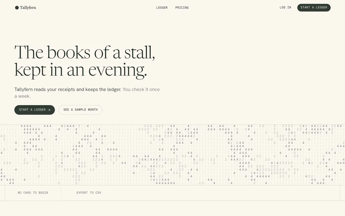
| Opening | Headline, one sentence, the button, one real screen | What is this, and is it for me? |
| How it works | Three or four steps, each with the screen where it happens | What would I actually be doing? |
| What you can do | Three to five things, in the user’s words | Does it cover my case? |
| Proof | Whatever you honestly have | Is this real? |
| Price | The number, and what is free | What does it cost me? |
| Questions | The four or five you are actually asked | What about…? |
| Close | The same button once more | All right. Where do I start? |
The technical minimum
None of this is visible when it is done well, and all of it is noticed when it is not:
- It is made for a phone first. Links to a new product are passed around in messages and posts, and those are opened on phones. Buttons a thumb can hit, text that does not need zooming, no sideways scroll.
- It has a title and a description. The
<title>is the line in a search result and in the browser tab; the description is the two lines under it. - It has a picture for sharing. When the link is pasted into a chat, the preview card is the first impression. Without an
og:image, it is a grey box. - It can be read. Text with enough contrast against its ground, including the small grey text.
- It still works without the animation. Some visitors ask their device for reduced motion. Nothing should stay hidden for them.
- It loads quickly. A landing page is mostly text and a few pictures; pictures saved at the size they are shown keep it that way.
Where Swarmsite fits
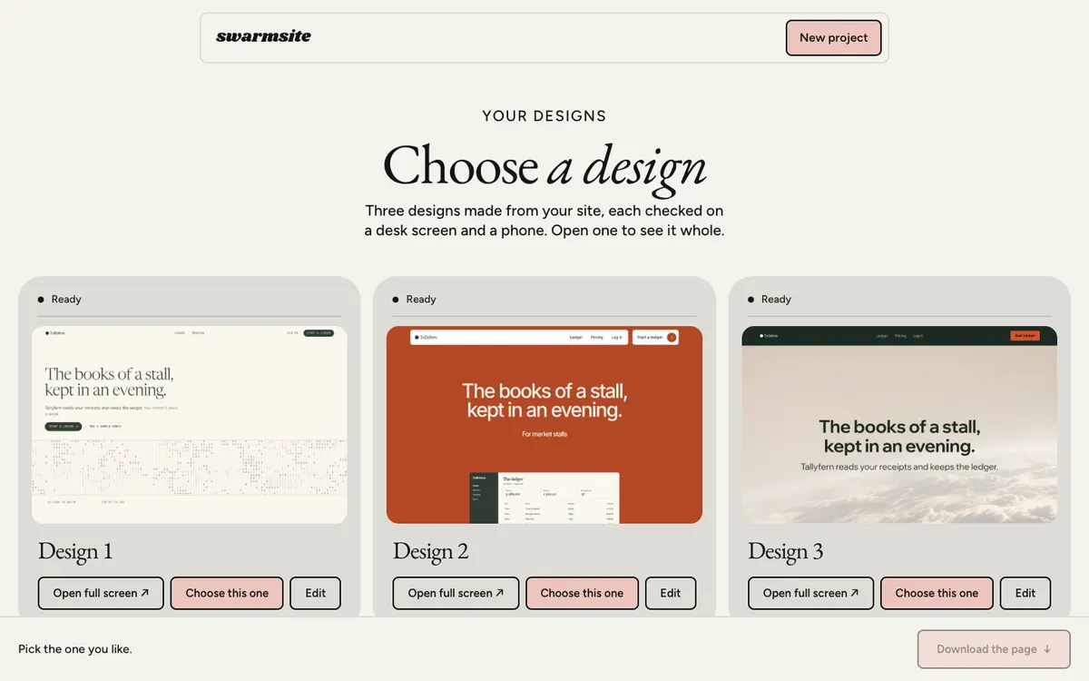
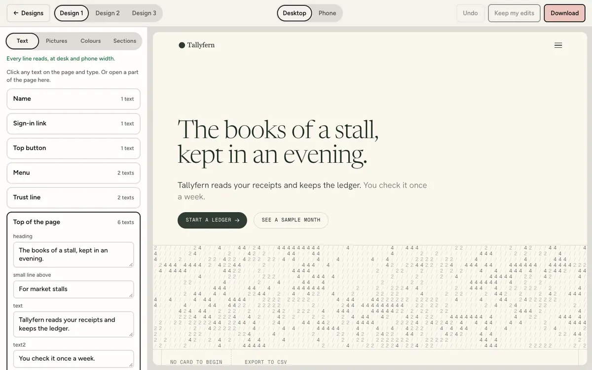
This is the case we built a way in for. Paste your app’s address and add up to six screenshots of it. Swarmsite reads what your page already says and sets your words and your screens into three finished designs, each checked on a desk screen and on a phone before you see it. Your screens are shown whole, never cropped.
Looking at the three costs nothing. If you keep one, it is 79 € once: you edit its words and pictures, download the HTML and CSS, and put it on any web host.
What it will not do is the part above that only you can: decide the one sentence, take honest screenshots, and name the price. Bring those, and the page has something true to say.